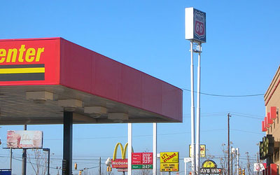
boingboing | Species mimicry in corporate logosNo fooling. All these companies that want to be noticed on the roadside have signs dominated by colors with contrast against sky blue. Who'da thunk it.
The logos of the fast-food joints on a stretch of desolate American road reveals a kind of species mimicry, or evolutionary convergence:
"...Notice how all of these companies use shades of red and yellow in their logos?"
(I'd link to the site from which boingboing got this blinding insight, but it's apparently been overwhelmed by the traffic. As an Olde Farte, allow me to be depressed that this is what fascinates the Generation That Will Shape The Future.)
[LATER: Now the original source, Random Connections is available, having, er, dugg out from underneath its bandwidth-alanche.]
No comments:
Post a Comment